How I brought direction to a fast-moving AI product
An experimental AI-driven site builder at GoDaddy was hallucinating and sending users into chat loops five weeks before launch and investor demo. I shifted the team’s focus from building more editing features to fixing the critical issues eroding trust in the product, and we shipped a demo we could stand behind.


Team
Skills
Timeline
Impact
Problem
Tunnel vision led to gaps in the journey
When I joined I found a team focused on creating editing tools without a map of how everything worked together, developing at the same time as designing.
The gaps showed up when you tried to get through the experience. A user could fall into a continuous chat loop with no clear path except to publish their site. The patterns used for editing allowed too many changes at once, which made the hallucinations worse. Key steps in the onboarding, like choosing a data center, had gone missing.
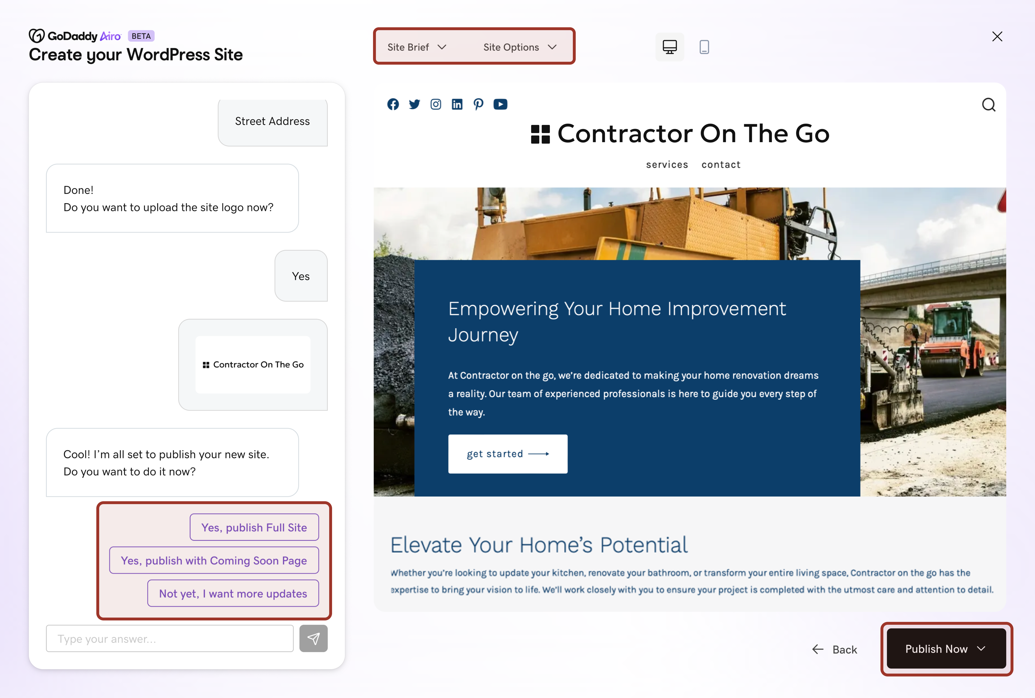
- Generating the site after the first response taxed the AI’s memory with each chat that followed, setting up a system where hallucinations were very likely.
- Editing tools were nested in dropdowns, making complicated interactions tricky. The bulk save contributed to hallucinations.
- Making publish the only path forward puts pressure to complete the site, and adds extra steps like setting up the domain name during onboarding.
Solutions
Trading more features for a better overall experience
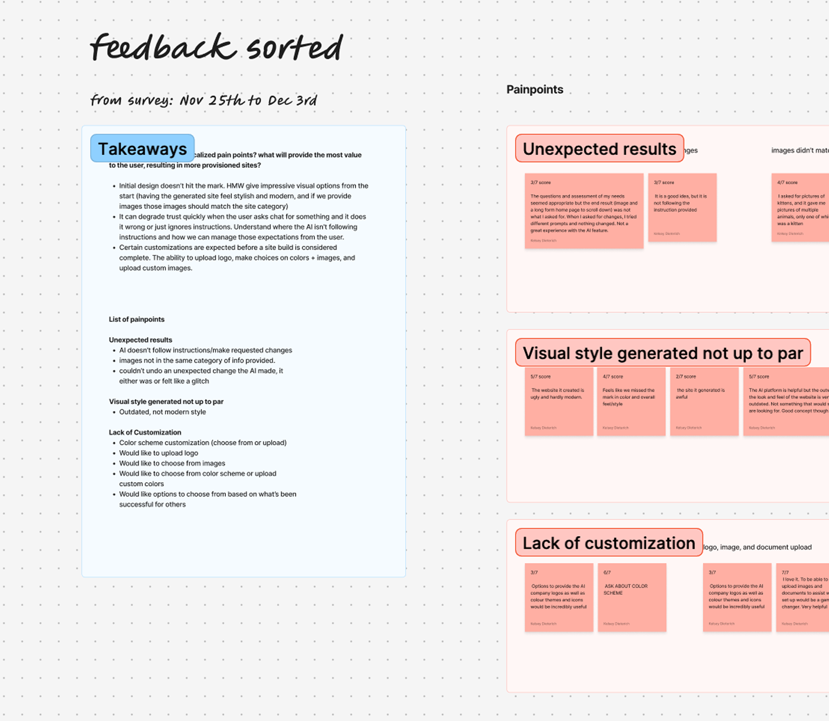
Calling out experience gaps from a user’s perspective made it easier for the whole team prioritize problems and propose solutions together. I led the conversation to pause on releasing editing tools until after the demo and focus instead on improving the hallucinations and chat loops that hindered the user getting through onboarding. We also added exit surveys to prioritize user feedback in these early stages.
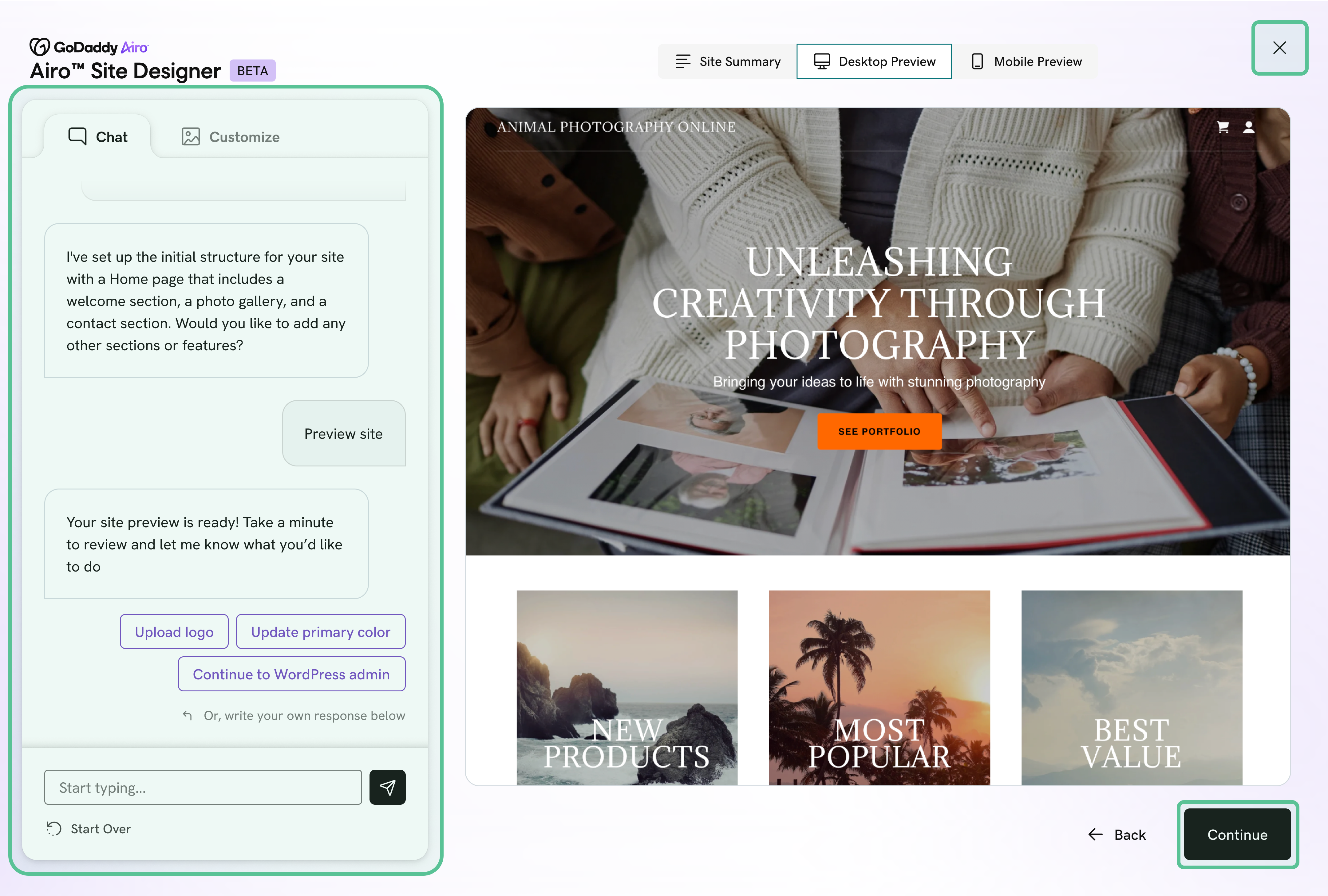
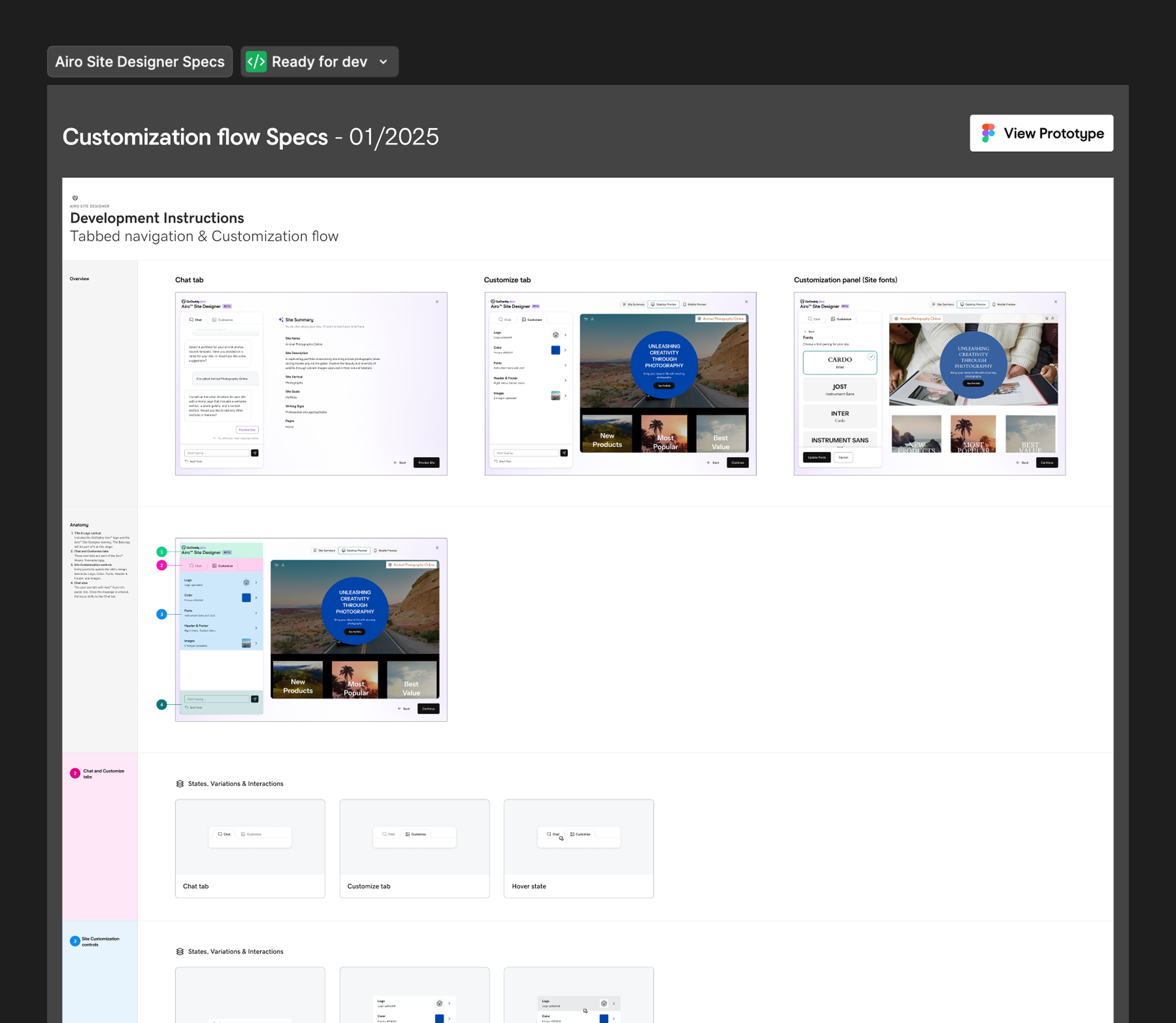
- We set up the flow into two steps, gathering info then editing. By gathering information up front the AI had more context to build a more accurate site on first try.
- The progress forward buttons are direct and not misleading to a published state.
- If the user closes out or leaves the experience, we use it as an opportunity to get feedback.
Focused UI patterns for editing your site
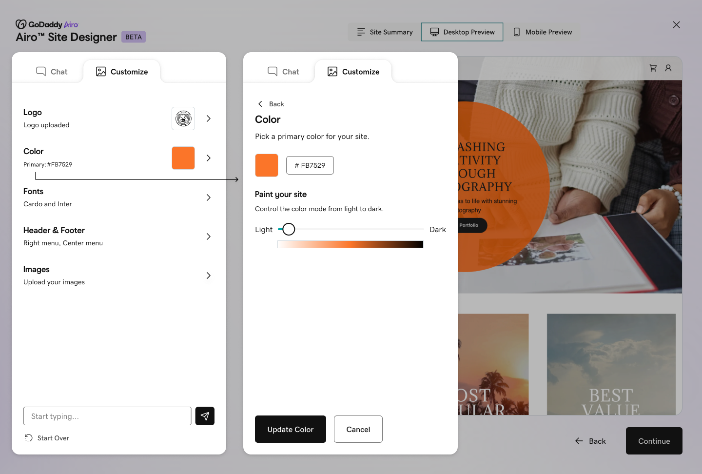
We fast followed after the demo with a stronger set of editing tools. I worked at a higher elevation workshopping what needed to be in the editing tools and high level patterns that wouldn't affect hallucinations. Rafael took point on crafting the UI patterns and all of the interactions that need to happen in between.
Delivering defined solutions instead of feature to feature
Instead of building everything at once, I drove a system to design and ship in milestones. We defined buckets of work and let real user feedback inform what came next. Shifting from a feature-by-feature push to milestone-based, user-first work allowed us to learn easier with each new push.
Impact
Why it mattered
Product outcome
The AI Web Designer was folded into GoDaddy’s official branded AI suite after the demo.
Team delivery
A milestone-based ship model gave design and engineering clarity on what each release owned.
Feedback loop
Exit surveys at drop-off points put customer feedback, not a feature list, in front of the team each release.
“Thank you, Kelsey, for joining in on the AI Web Designer project and making huge contributions in a short amount of time, to help us deliver the best possible experience by our December timeline. It has been fantastic to watch your partnership with Rafael & the whole prod/eng team.”
Reflection
Design as a driver for clarity
On reflection: My most impactful work came from holding context for the whole experience while the team was focused on the individual parts. Suggesting we pause on shipping editing tools created tension. That part is hard for me, because I’m relationship-oriented and I care about my partnerships. What I took away is how to advocate for what I see while still partnering closely with the team. My favorite piece of feedback on this project came from one of the AI engineers: “Fighting for customer experience and asking difficult questions is what makes this company better. Thank you so much for all your hard work in achieving great customer outcomes.”
Next case study