How I built the design system behind GoDaddy's first product theme.
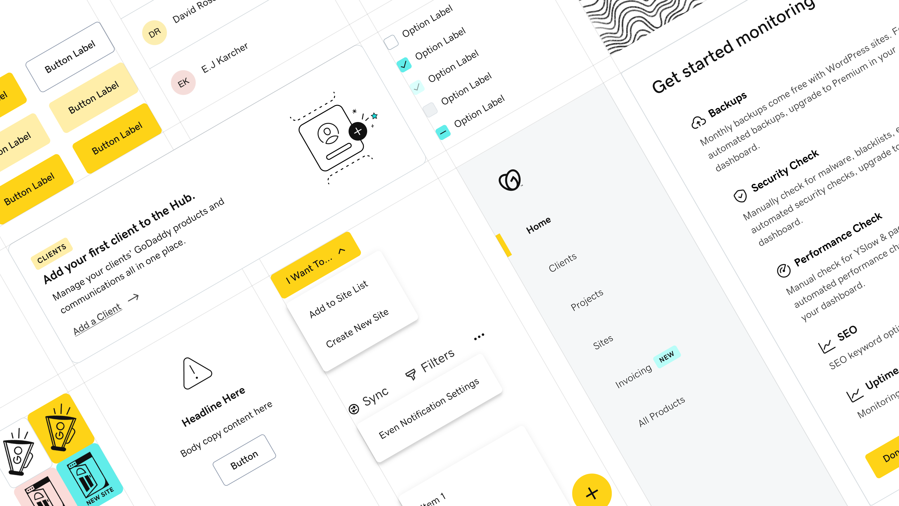
GoDaddy Pro had a new brand on its marketing surfaces but no translation for in-product, so seven designers were building the Hub with the old design system, and hardcoding what didn’t fit. I led the design system that closed that gap: defining the token foundation, building the component library, and partnering with engineering on a still-being-built theming backend so the Hub could launch on brand. The launch generated $245M in revenue, and the system held through the 360K customer migration that followed.
Team
Skills
Timeline
Impact
Problem
A brand built for marketing that needed a transition into product.
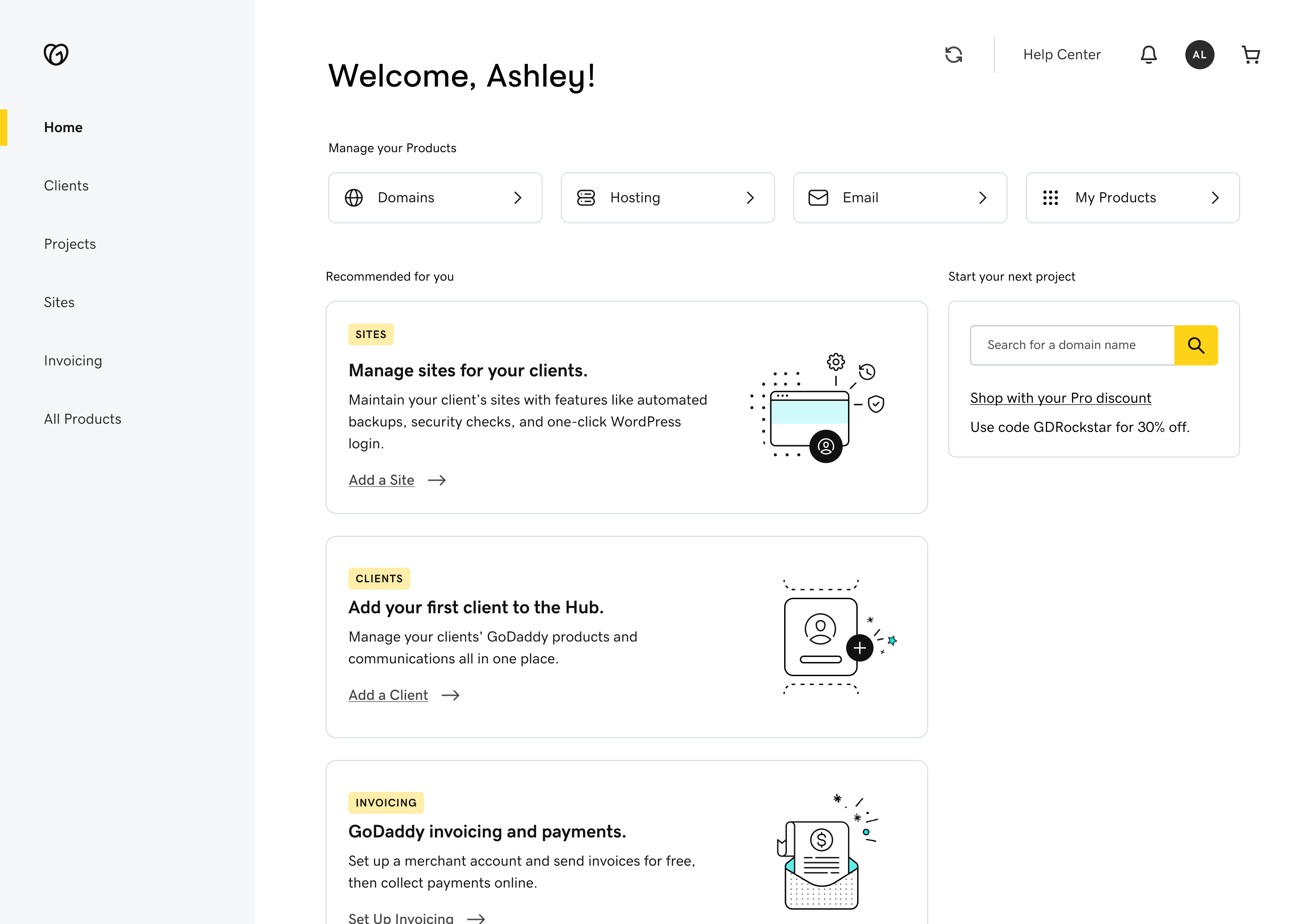
The Hub by GoDaddy Pro launched for web professionals in 2021. This launch coincided with a bigger vision to update the in-product design language across GoDaddy’s ecosystem. The Hub would be the first product to adopt the new vision, as a theme with its own brand.
Front of site and advertising were already built on it, and leadership wanted the Hub to launch on that brand and use the new theming technology engineering was actively building. Translating the vision work to real production components was the gap I filled. Without a design system, screens would get built with a mix of GoDaddy’s main brand components and hardcoded styles. Design and engineering were stuck and needed a foundational system to start working with.
Solutions
Turning brand guidelines into a scoped list of token changes.
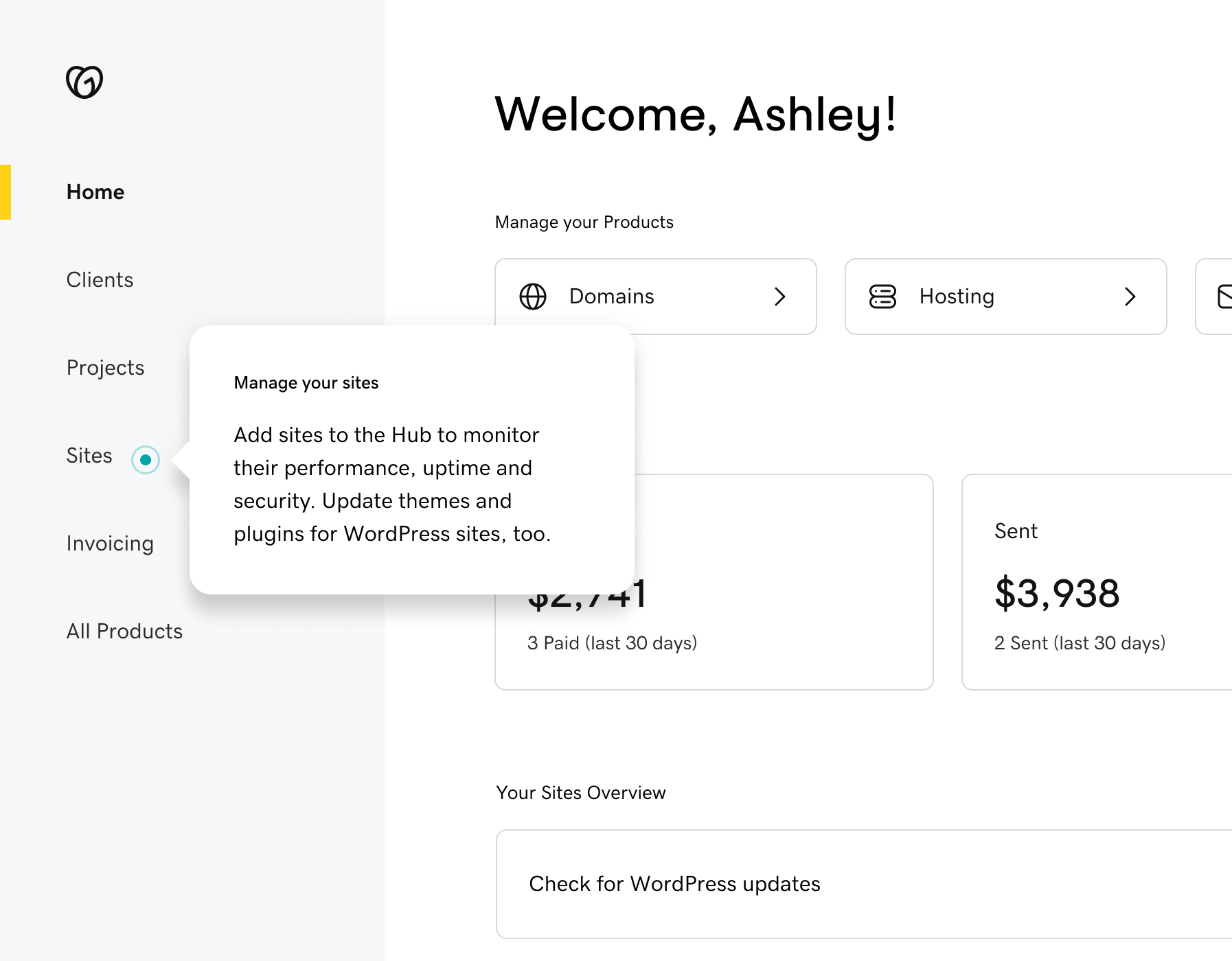
I partnered with our design director to sketch high-fidelity screens showing how the brand guidelines would work on the interfaces our designers were already building. Mapping one to one against the main design system told us exactly which components needed theming and which values had to change underneath them. That gave us a scoped list instead of a redesign.
Choosing accessible states for inline buttons.
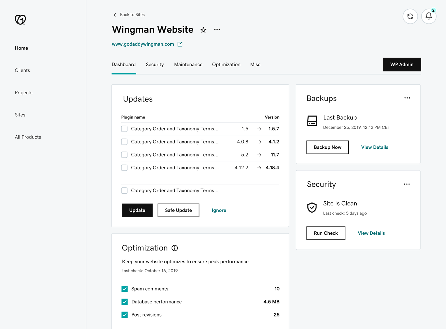
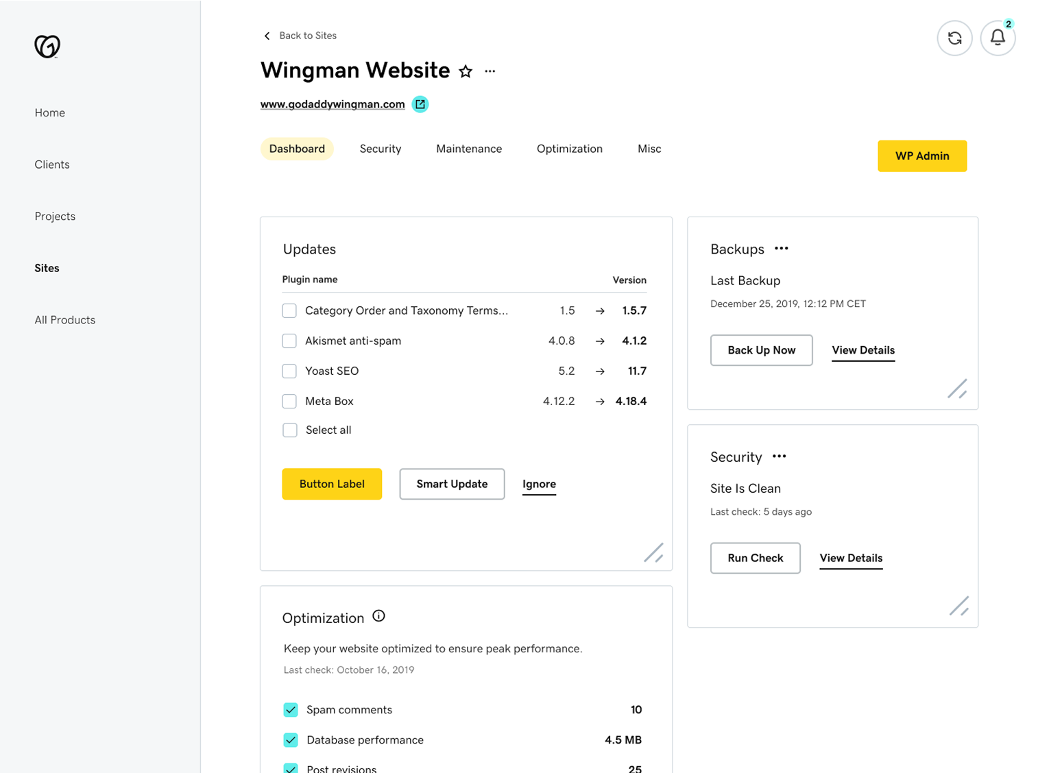
The Pro brand palette didn’t have colors that passed contrast when used as text. The main GoDaddy brand used its version of teal which passes contrast on white backgrounds, but even the main brand had accessibility problems because it only used color as a differentiator, which gets problematic when the inline buttons are close to text. Dense, technical dashboards (like hosting settings) run into this problem the most, and they often live in the Pro ecosystem. In our theme I defined our default inline buttons to black with an underline, and use the main GoDaddy brand color on hover.
This cleared us of accessibility problems and moved us closer to the vision the main brand was defining for future systems.
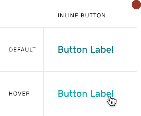
The original inline buttons don’t pass
- Color is the only button distinction.
- The hover color is on brand, but only 3:1 contrast.
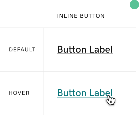
The new inline buttons do pass
- An underline is used to distinguish between text and button.
- The hover color borrows from the main brand and has a contrast of 4.5:1.
Adapting to a backend that was still being built.
The theming backend was less robust than we expected. Values we had designed against did not exist in the system yet, and the team building it had priorities outside the Pro theme. Working closely with the engineering lead and rest of the team, we took each gap case by case and picked one of three options: store the value locally, hardcode it and fix it later, or pare the design back to what the system could actually support. Understanding what each team was optimizing for is what made those conversations productive.
We also coded a page together that laid out where the theming technology and our needs diverged. Documenting the gap made it something the team could point at and plan around instead of rediscovering it one component at a time.
Scaling from one product theme to the broader design language.
I owned the Pro pattern library for a year alongside my product work. When we dedicated a principal designer to the Hub’s design language, I partnered with the design foundations team to scale the new design language across GoDaddy’s other in-product teams.
I represented Pro in the foundations workshops where in-product teams aligned on shared patterns. I updated existing components against what we’d learned building the Hub, and contributed new components back so other teams could use them on their own surfaces.
Each month I brought what we were learning in foundations back to my product team, so the Pro theme stayed aligned with the shared system as it evolved.
Impact
Unblocked the launch, and pressure-tested the platform for the rest of the org.
Product outcome
Launching under the Pro brand and on the new theming technology was leadership's vision. Without the theme there was no map from the designs to the system that had to render them.
Team delivery
Seven designers moved from individual interpretations to a Figma pattern library, and 10 to 20 engineers consumed the same theme in code across the full Hub ecosystem.
Org outcome
Pro was the first product on the new theming technology, and what broke for us became the feedback that helped the main GoDaddy brand move onto it.
Reflection
Understand the stack before you design against it.
There were many challenges over the years with this system, but two themes were the most consistent: miscommunications with the technology stack, and keeping the teams (design, engineering, and product) in the loop. Documentation and understanding how your system is set up from a code perspective are two of the most important pieces of managing a design system.
Next case study