GoDaddy · The Hub by GoDaddy Pro · 2023 · 5 months
How research informed a redesign that lifted new sites 25%
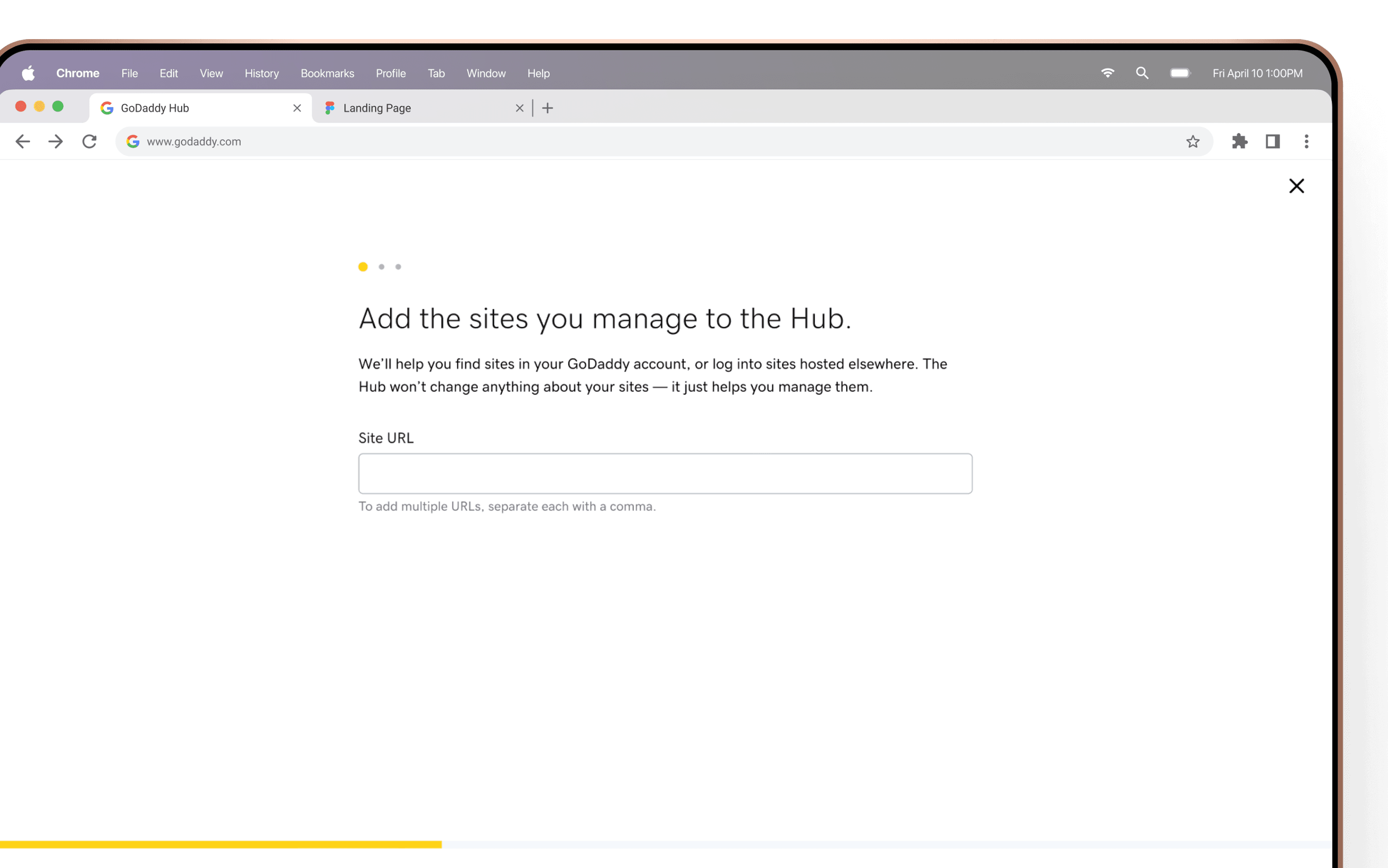
Adding a site was the first step toward the features users were promised at signup, and almost nobody was doing it.I ran user interviews to understand how our audience actually thought about “adding a site,” then used what I learned to redesign the activation flow. Sites added went up 25%, and the language changes on their own lifted entry-point click-through by 59%.
Context
- Product:The Hub by GoDaddy Pro, a site and client management experience for web professionals.
- Role:Lead Designer. I created and ran research and then redesigned the flow, partnering with 1 PM and 3 engineers.
- Timeline:2023, about 5 months
- How we defined success:More active users completing the add-a-site flow, the product’s primary activation KPI.
- Outcome:25% more sites added, a 59% lift in entry-point click-through from language changes alone, and research the wider org reused to understand the Pro audience.
- What I took away:The project was too big for one launch. I’d break it into contained experiments so each change could be measured on its own.
Almost nobody was starting the flow
Adding a site is where the Hub becomes useful. It unlocks the client and site-management tools that are the whole reason a Pro customer is there, but the entry points had low click-through, and even active users were adding very few sites.
This indicated that something wasn’t connecting between the product’s position and the customers. I ran interviews with both new users and potential new users, having them start from the very beginning of GoDaddy’s front of site and walking through how they would add a site to the Hub. Along the way I asked questions about how they interpret what the Hub is and what adding a site means.
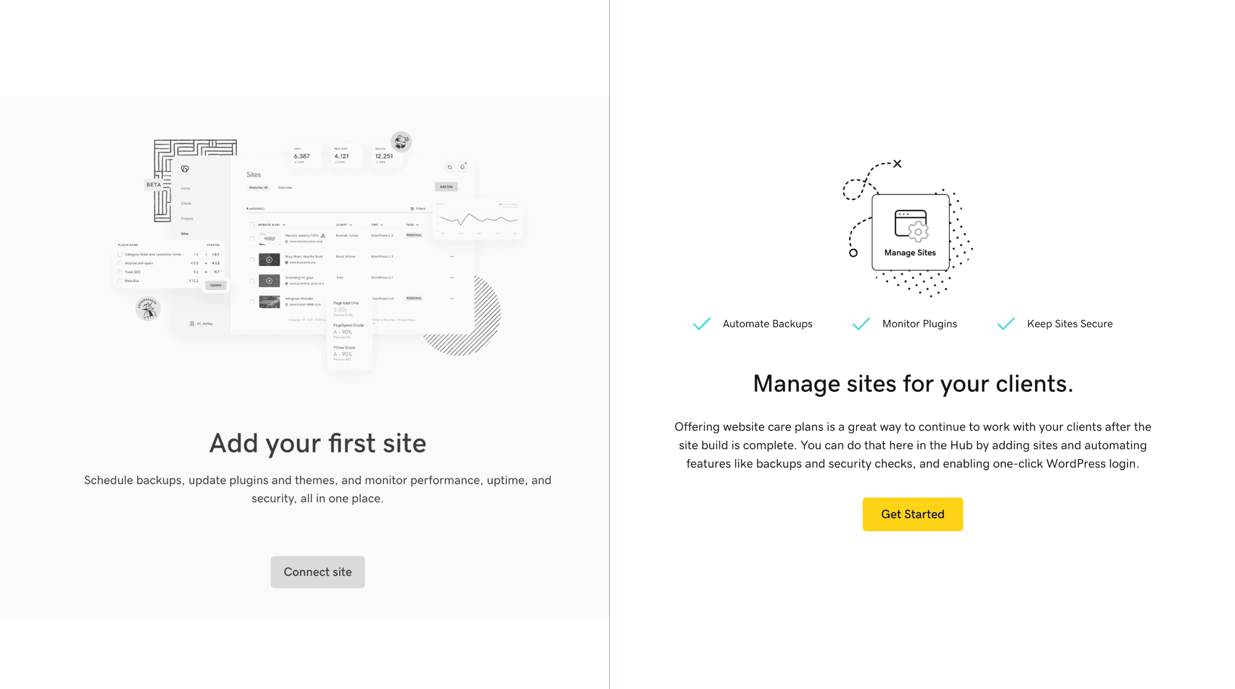
Users didn’t know what adding a site did for them.
The old entry point used action-based text that named the task without why. The words “add” and “connect” can mean a lot of things with websites. Are we creating a new site by adding?This was a common thought during the interviews. In reality, you’re just putting a site on a list that allows site maintenance to run.
We led with value instead. Adding a site is a step toward the features, not the goal, and we make it clear that adding doesn’t change or alter your site in any way.
The words we used implied risk and permanence
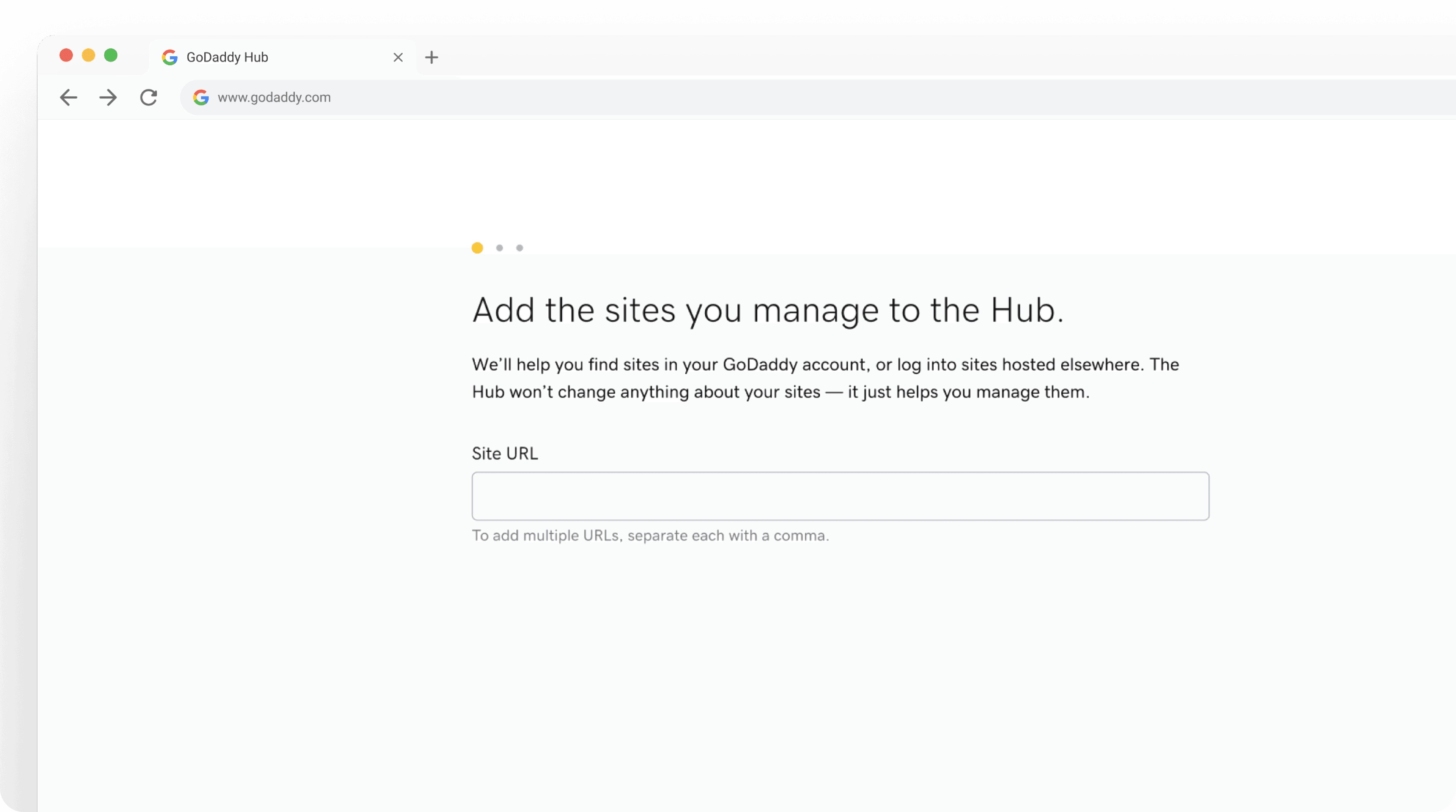
Users read “connect” as something permanent, and the next step of the flow introduced “external,” a term that appeared nowhere else and went unexplained. These users are fiercely protective of their reputation as web designers and developers: “I’m not going to risk my client’s site.” If it wasn’t obvious exactly what adding a site would do, they wouldn’t take the chance.
The choice between “GoDaddy Sites” or “External Sites” was genuinely confusing, and something we could detect ourselves. We moved that determination to the backendso users didn’t have to reason about “external” at all. The redesign reduced complexity by removing a confusing choice and speaking warmly and plainly about what happens next.

We were treating a normal step as an error
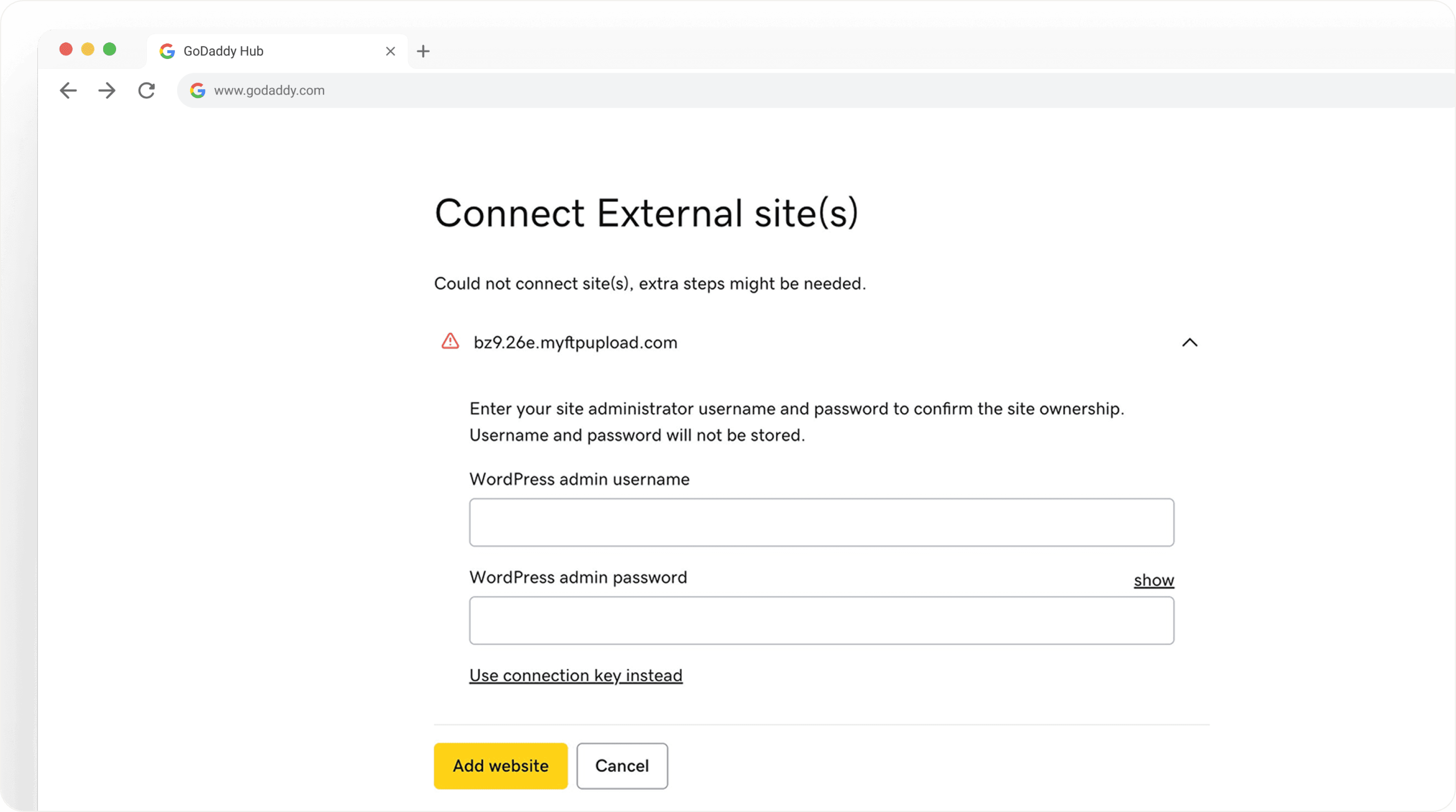
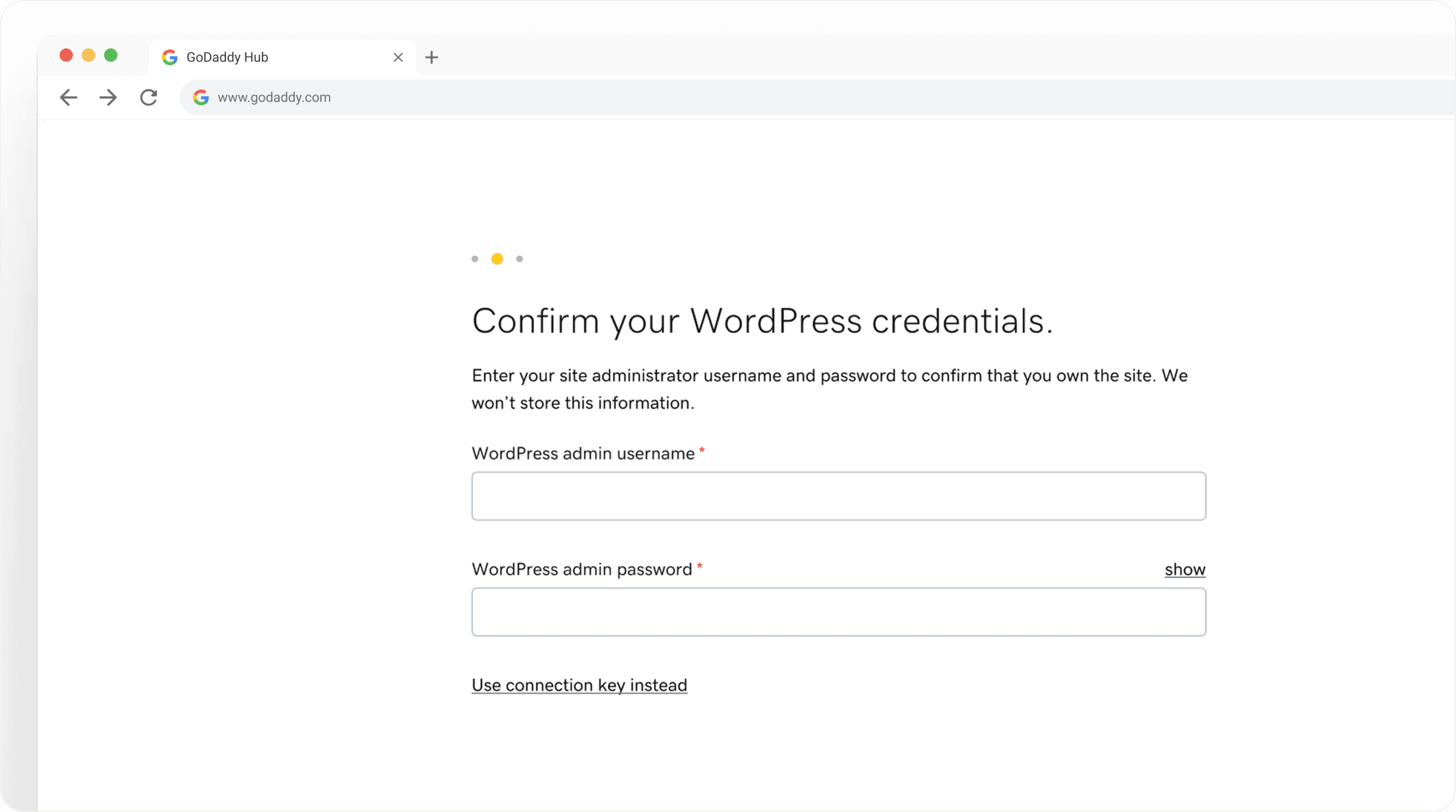
A common verification step, where a user simply enters credentials, was being surfaced as an error. It was an artifact of reusing a bulk-template pattern in a space that didn’t need it, adding to the user’s cognitive load.
Breaking apart that bulk pattern let us treat each use case with the right context. The redesign treats the credentials as a step, and the other error states with individual descriptions so the user knows what happened and what they can do next instead of inheriting a generic template.
Why it mattered
25% more users completed activation and added a site. The language changes alone lifted entry-point click-through by 59%, which told us how much of the problem had been positioning based. The interview findings outlived the project too. They became content guidelines other teams reused to understand the Pro audience, so the research paid off well beyond this one flow.
What I learned
Running the interviews and rebuilding the entire flow as a single launch meant extra time on the project that not everyone was expecting. I learned the importance of setting expectations, especially with research.
On reflection: I’d break a project this size into contained experiments, error handling, content, and UI as separate pushes, so each change produces a timely, measurable result. I’d also set clearer expectations up front on how long research takes, so the team plans around it instead of absorbing it into one deadline.
Next case study